
Custom Branded GoHighLevel Dashboards: Why the Default Look Is Costing You Clients
Every GHL sub-account ships with the same green, generic dashboard. What a fully branded GoHighLevel dashboard actually involves, the research behind why it matters, real before/after examples, and how to get one built.
Open ten different GoHighLevel sub-accounts and you’ll see the same dashboard ten times over: the same green sidebar highlight, the same rounded white cards, the same donut charts in the same default colors. Nothing about it says which agency built it or which business it belongs to — it just says “this is GoHighLevel.” For a client who’s paying for a custom-built system, that’s a strange thing to be reminded of every time they log in.
This isn’t a small aesthetic quibble. It’s the difference between a dashboard that reads as a product you built for a specific business, and one that reads as a free trial account nobody bothered to finish setting up. The data underneath can be identical — same metrics, same automations, same reporting logic — and the two still land completely differently the moment a client actually opens the tab.
This guide covers what branding a GoHighLevel dashboard actually involves beyond the logo slot GHL exposes by default, the research behind why visual presentation measurably changes how work gets perceived, what’s possible natively inside GHL versus what needs a custom build, and a step-by-step process for doing it properly — plus real screenshots of the same dashboard structure carried across four different brand palettes.
Why the default look is a real cost, not just a cosmetic one
A dashboard is one of the few pieces of the client relationship a client actually opens and looks at on their own, without you in the room to explain the value behind it. Proposals get read once. Onboarding calls happen once. A dashboard gets opened dozens of times over the life of the account — sometimes daily, if it’s doing its job. Every one of those visits is either reinforcing “this was built for me” or quietly chipping away at that impression.
If the dashboard looks identical to the free trial account a competitor spun up last week, it undersells everything else that went into the build — the automations, the custom fields, the workflow logic nobody sees because it happens in the background. Visual polish is doing real work here: it’s the fastest signal a client has for “this was built specifically for me” versus “this is a template with my logo pasted on,” and clients form that impression in seconds, long before they’ve actually read a single metric on the screen.
Clients rarely say “the dashboard looks generic” out loud. It shows up instead as “what am I actually paying for?” — a question that’s much harder to answer defensively than it is to avoid by not giving them a reason to ask it.
There’s decades of design-credibility research backing up why this happens so fast. Stanford’s Web Credibility research, one of the most widely cited studies in the field, found that roughly 94% of a visitor’s first impression of a website is design-related rather than content-related, and that a majority of users judge a company’s credibility largely off how it presents itself visually before they evaluate anything else about it. A GoHighLevel dashboard is not a marketing website, but the mechanism is identical: a human being opens an interface, forms a snap judgment about competence and trustworthiness within a second or two, and then reads everything that follows through the lens of that initial judgment. A dashboard that looks stock reads as commodity software before a single number has registered.
What “branded” actually covers
Branding a GoHighLevel dashboard isn’t limited to dropping a logo into the sidebar — that’s the part GHL already exposes by default, and it’s the least of what actually changes a dashboard’s first impression. A full rebrand typically touches:
Sidebar and header color — the active-state highlight, icon colors, and top navigation bar recolored to match a brand palette instead of GHL’s default green.
Chart and widget colors — donut charts, progress rings, bar charts, and status badges recolored consistently, so a pipeline chart doesn’t clash with a brand palette it’s sitting inside.
Buttons and interactive elements — primary action buttons (“Edit dashboard,” “New”), toggles, and filters restyled to match, rather than staying GHL-green against a rebranded shell.
Browser tab and favicon — the small details that make a dashboard feel like a real, dedicated product rather than a GHL sub-account with a custom skin over part of it.
Custom widgets and layout — for accounts that need it, purpose-built widgets and layout changes beyond what GHL’s dashboard editor exposes natively. This is where a branded dashboard starts to look genuinely custom-built rather than recolored.
Empty states, tooltips, and micro-copy — the small in-between moments (a loading state, a “no data yet” placeholder) that off-the-shelf dashboards leave in GHL’s default voice and styling, and that a fully finished build carries the same brand treatment through.
What GoHighLevel actually gives you natively
It’s worth being precise about where GoHighLevel’s own settings stop, because agencies routinely either over- or under-estimate this. GHL’s higher-tier plans unlock SaaS Mode and agency-level white-labeling, which cover the account shell: a custom login domain, your own logo and app name in place of “HighLevel,” branded email notifications, and (depending on plan) a fully white-labeled mobile app. That’s a real, useful layer, and it’s the correct starting point — there’s no reason to rebuild what GHL already gives you for free or for a plan upgrade.
What native white-labeling does not touch is the dashboard’s internal design system: chart colors stay GHL’s defaults, the sidebar’s active-state color stays green, donut and bar chart palettes don’t shift, and widget layout is limited to what the built-in dashboard editor exposes. In GoHighLevel’s own words, on their post about reporting for agencies, “[reporting] is the linchpin of success in the digital marketing world” — but the tooling they ship natively is built to be broadly usable across every industry and every agency’s brand, not tailored to any one of them. That’s exactly the gap a custom branding pass fills.
| Native GHL white-label | Custom dashboard branding | |
|---|---|---|
| Login domain & app name | ||
| Logo in sidebar/header | ||
| Sidebar & header color theme | ||
| Chart & donut color palette | ||
| Button & interactive-element color | ||
| Browser tab favicon | ||
| Custom widgets beyond native editor | ||
| Requires GHL plan upgrade | Yes (SaaS Mode) | No — works on your existing plan |
Here’s the same underlying dashboard structure carried across a few different brand palettes — the data, layout, and widgets are identical; only the color system changes:
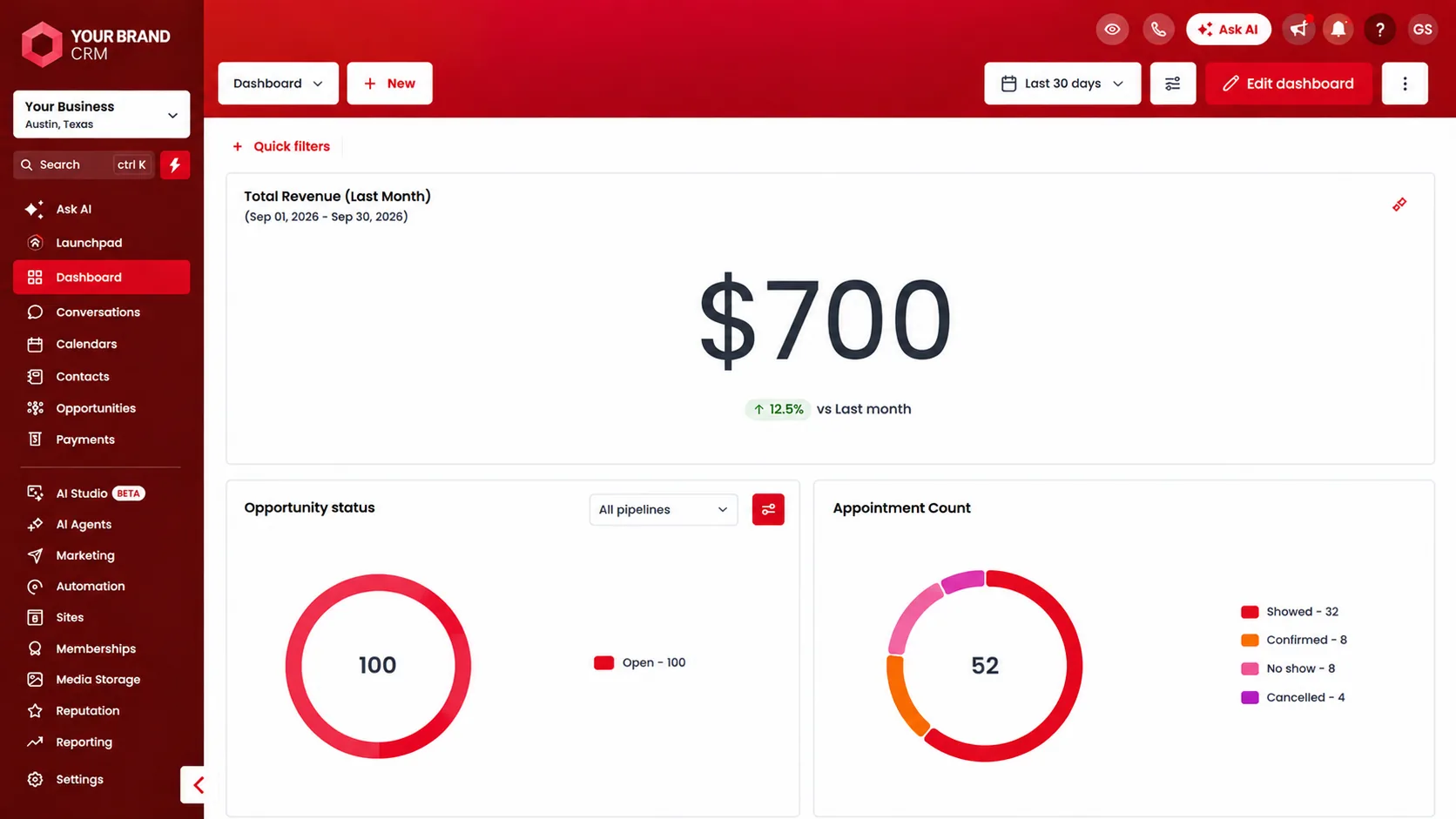
The same dashboard, several ways — see the full set on the custom dashboards page.
The research behind why this actually moves the needle
It’s easy to treat this as a subjective design preference — “some people like a branded look, some don’t.” The research doesn’t really support that framing. Consistent visual branding has a measurable, repeatedly-studied effect on how businesses perform financially, not just on how they’re perceived aesthetically.
Up to 33%
Revenue increase associated with consistent branding across a business, per Lucidpress's State of Brand Consistency benchmark study
~94%
Of a first impression is design-related, per Stanford's widely cited Web Credibility research
89%
Of customers say they're more loyal to companies they trust, per Salesforce's State of the Connected Customer report
Lucidpress’s benchmark research, based on a survey of over 200 organizations, found that companies presenting their brand consistently across every touchpoint saw revenue gains as high as 33% compared to those with inconsistent presentation — a figure that grew from an already-notable 23% reported in the firm’s earlier 2016 study. A GoHighLevel dashboard is a touchpoint in exactly the sense that research is measuring: it’s a surface a client interacts with regularly, and if it doesn’t match the rest of a business’s brand presentation (the website, the proposal deck, the email footer), it’s an inconsistency working against the same revenue relationship that consistent branding is shown to strengthen.
Separately, Salesforce’s State of the Connected Customer research found that 89% of customers report being more loyal to companies they trust, and that transparency is one of the most consistently cited drivers of that trust. A dashboard is one of the most transparent things an agency can hand a client — it’s a direct, ongoing window into what’s actually happening with their account. When that window is dressed in a way that visibly doesn’t belong to the business it’s reporting on, it undercuts the very transparency effect the dashboard exists to create.
None of this requires touching the underlying data model or reporting logic — it’s a presentation-layer decision, which is exactly why it’s one of the highest-leverage, lowest-risk upgrades available to an account that already has its reporting sorted out. If the metrics themselves still need work first, our guide to building GHL dashboards clients actually trust covers that groundwork — the two work well done together, but branding doesn’t have to wait on a full metrics overhaul to start paying off.
Get your GHL dashboard out of the default green
We rebuild the layout, colors, and widgets around your brand — any palette, any logo — so what clients open every morning looks like your product, not a stock CRM template.
Same data, different first impression
This matters most when a client’s first reaction to a new tool sets the tone for how seriously they take everything else in it. Two dashboards can be technically identical — same metrics, same data sources, same update frequency — and still produce very different reactions purely based on presentation:
| Default GHL look | Branded dashboard | |
|---|---|---|
| First impression | "This is a CRM" | "This is our system" |
| Visual consistency | Clashes with brand materials | Matches funnels, emails, proposals |
| Perceived build effort | Looks templated | Looks custom-built |
| Client confidence at login | Neutral to skeptical | Reinforced on every visit |
| Renewal conversation framing | "What am I paying for?" | "This is clearly ours" |
That last row is worth dwelling on. Renewal and upsell conversations happen in the shadow of every prior interaction a client has had with the account — and a dashboard opened weekly for months is a much bigger cumulative influence on that framing than most agencies give it credit for. A client who’s spent six months looking at something that visibly belongs to their business walks into a renewal conversation already primed to see the relationship as a partnership rather than a vendor arrangement.
Same dashboard, four palettes — proof it’s genuinely flexible
The most common hesitation agencies have before commissioning this kind of work is a reasonable one: “will it actually look right in our colors, or does this only work for a green/blue SaaS palette?” The honest answer is that the underlying dashboard structure — cards, charts, donut rings, sidebar navigation — is color-agnostic by design, which is what makes a genuine multi-brand rebrand possible in the first place rather than a one-off custom job that only works for a single palette.
Below is the identical dashboard — same metrics, same layout, same widgets — carried across four distinct brand themes, purely to demonstrate that this isn’t a stylistic trick that only works for one kind of brand:
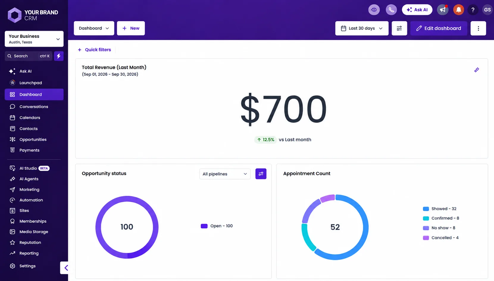
A cool, saturated palette — every chart segment, badge, and button recolored, not just the header bar.
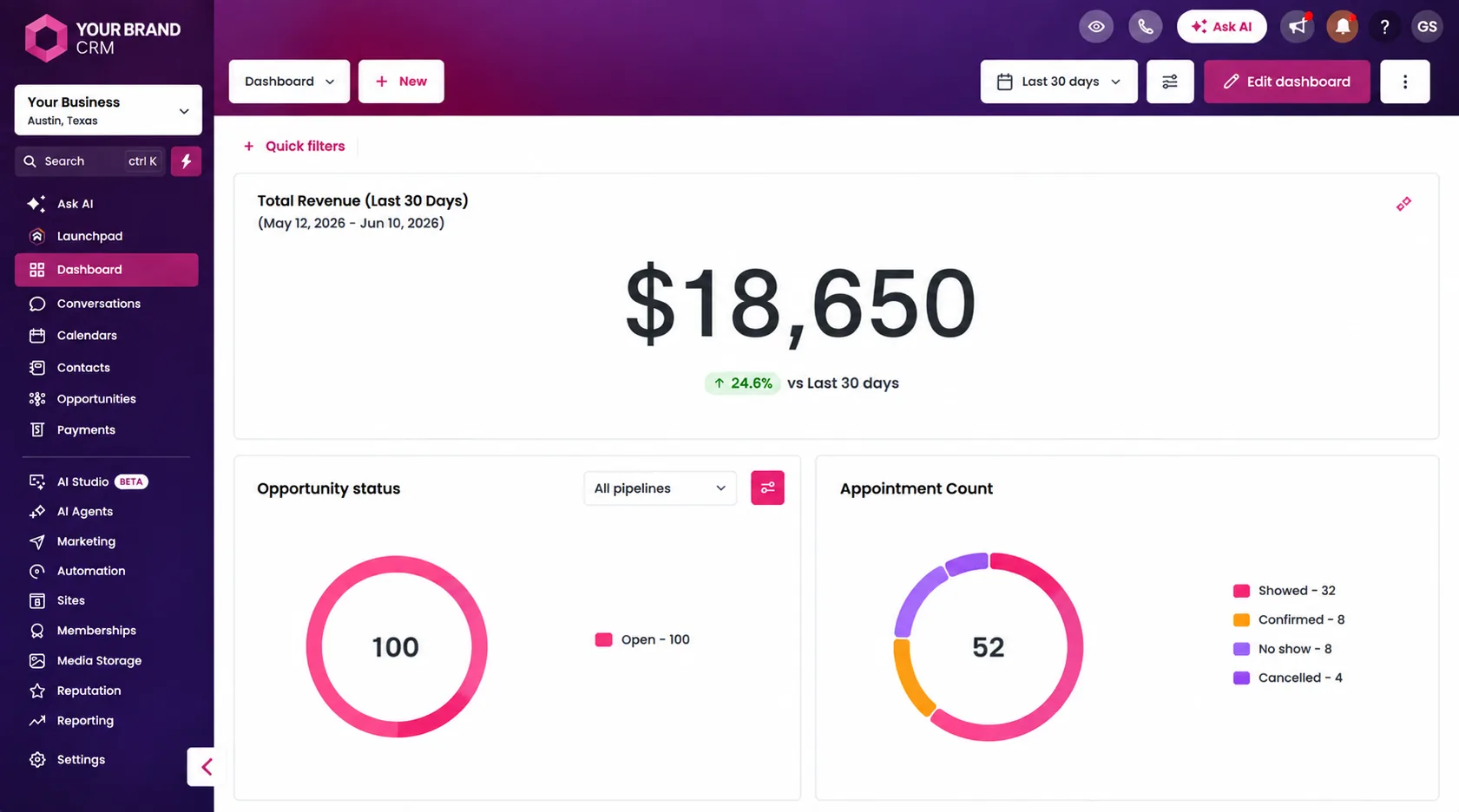
A warmer, high-contrast palette — proof this isn’t limited to conventional “corporate” blues and greens.
The takeaway isn’t “pick one of these four” — it’s that whatever a specific brand’s actual palette is, the same underlying build approach carries it through consistently. A business with a deep navy and gold identity gets navy and gold; a business with a bold coral identity gets bold coral. The dashboard adapts to the brand, not the other way around.
A branding pass actually involves five concrete steps
Step 1: Pull the brand palette. Primary and secondary colors (as hex values, not just “our blue”), logo files in both light and dark variants, and any existing brand guide. If none exists yet, a short discovery pass defines one before any dashboard work starts — this is a common and reasonable first step for younger businesses that haven’t formalized a brand guide but know roughly what they want.
Step 2: Map every themed surface. Sidebar, header, buttons, chart colors, status badges, and favicon each get mapped to a specific brand color individually, so nothing is left half-branded. This is a common failure mode when branding is done as an afterthought: a rebranded shell around still-green charts, which reads as unfinished rather than intentional, and often looks worse than no rebrand at all.
Step 3: Apply and test across real data. Colors that look right on a mockup can behave differently against real chart data — a donut chart with five brand-adjacent shades needs enough contrast between segments to stay legible, not just on-brand. This step is where a rushed rebrand shows: a palette that photographs well in a style guide but produces two indistinguishable pie-chart slices in practice.
Step 4: Handle client-facing vs. internal separately, if both exist. A client-facing view and an internal operational view often warrant slightly different treatment — the client view leaning fully into brand identity since that’s the audience the branding is for, the internal view prioritizing information density for a team that already knows the interface and doesn’t need the same visual reinforcement.
Step 5: Roll out with a short walkthrough. Even a purely visual change benefits from thirty seconds of context — “we rebuilt this in your colors” — rather than letting a client stumble onto it cold and wonder if something broke, or worse, not notice the effort that went into it at all. A one-line email or a moment at the start of a check-in call is usually enough.
Common mistakes when branding a dashboard
Rebranding the shell but not the data widgets. A purple sidebar wrapped around donut charts still rendering in GHL’s default green/blue reads as incomplete, not intentional — every themed surface needs to move together, or the inconsistency becomes more noticeable than no rebrand at all.
Choosing brand colors with poor chart contrast. A palette that looks great as a logo can produce charts where adjacent segments are nearly indistinguishable — legibility has to be checked against real chart data, not just brand swatches, before calling a palette finished.
Treating it as a one-time, unmaintained skin. As a brand evolves — a color refresh, a new logo — the dashboard should be revisited too, the same way a website or marketing materials would be, rather than staying frozen at its original launch styling indefinitely while everything else around it moves forward.
Skipping the favicon and tab title. Small, but it’s one of the first things a client sees dozens of times a day in their browser tab bar — a generic GHL icon sitting among a rebranded dashboard undercuts the effect for a detail that costs almost nothing to fix once everything else is already done.
Branding once and never testing on mobile. Agency owners and clients alike frequently check dashboards from a phone between meetings. A palette and layout that reads cleanly on a 27-inch monitor can produce cramped, low-contrast charts on a small screen if that check never happens before rollout.
How to tell if it actually worked
Because this is a presentation-layer change rather than a new feature, it’s tempting to treat it as unmeasurable — something you either like the look of or don’t. In practice, there are a handful of concrete signals worth watching in the weeks after a rebrand ships, and they’re the same signals that matter for dashboard adoption generally, not something unique to the branding pass itself.
Login frequency, if your account setup can track it, is the most direct signal. A dashboard that clients open more often after a rebrand than before is a dashboard doing a better job of pulling them in on its own, independent of anyone prompting them to check it. Unprompted questions about the data — a client referencing a specific number from the dashboard without being asked “have you seen your dashboard?” — is a strong qualitative signal that it’s become part of their routine rather than something they open only when reminded. Renewal and upsell conversations that reference the dashboard directly (“I saw on our dashboard that…”) indicate it’s functioning as intended proof of value, not just sitting there technically accurate but practically ignored.
None of these signals show up overnight, and none of them isolate branding as the sole cause — a rebrand rolled out alongside other account changes will always have its effect blended with everything else that happened at the same time. But directionally, agencies that make this change tend to report the same pattern: a modest but real uptick in how often clients reference the dashboard unprompted, which is really just the practical, on-the-ground version of the trust and loyalty research cited earlier in this guide.
Talking to clients about a rebrand without over-selling it
There’s a version of this conversation that goes wrong: leading with “we rebuilt your dashboard!” as though it’s a headline feature, which sets an expectation the actual change can’t live up to and can come across as more sales pitch than substance. The better framing treats it as what it actually is — a quality-of-experience improvement that happens to be worth mentioning, not a new capability.
A short, low-key note tends to land better than a formal announcement: something in the spirit of “quick note — we rebuilt your dashboard in your brand colors this week, no action needed on your end, just wanted you to see it looks like yours now.” That framing does two things at once. It surfaces the work without overselling it, and it implicitly reminds the client that ongoing attention is being paid to their account even on details they didn’t explicitly ask for — which, per the trust research above, is exactly the kind of unprompted signal that reinforces the relationship rather than just maintaining it.
For agencies managing several accounts, batching this kind of rollout — rebranding a handful of dashboards in the same week rather than one at a time whenever it’s convenient — tends to produce a cleaner, more consistent set of client touchpoints, and makes it easier to write one version of that rollout message rather than improvising it account by account.
Who this matters most for
Not every account needs this on day one, but a few situations make it a clear priority rather than a nice-to-have. Agencies white-labeling GoHighLevel as their own platform are the most obvious case — if clients are already being told “this is our system,” a dashboard that visibly says “GoHighLevel” undercuts that positioning directly. Agencies managing several client accounts benefit from being able to brand each sub-account to match that specific client, rather than every account in the portfolio looking identical regardless of who it belongs to. And any business using GHL as a client-facing reporting tool, not just an internal CRM, has the most to gain — a branded dashboard is effectively a piece of the product experience for accounts where clients regularly log in themselves.
Design work that touches a dashboard’s visual system often overlaps with broader brand asset needs — funnel graphics, email headers, and proposal materials that should carry the same palette. If that’s a gap too, our graphics design service covers that alongside dashboard work, and either can be scoped through a scope call or reviewed against current pricing before committing to anything.
Bringing it together
The metrics and automation behind a dashboard are what make it useful. The branding is what makes it feel like it belongs to the client rather than to GoHighLevel — and the research is fairly consistent that this distinction shows up directly in how much value a client attaches to what they’re paying for, how loyal they stay, and how a renewal conversation gets framed months down the line. It’s also one of the cheaper, faster upgrades available compared to a full metrics rebuild, which makes it a reasonable starting point for any account still running the default look.
If your dashboard — or your clients’ — is still running stock GHL green, see how a custom-branded build looks in practice, or book a scope call to talk through what a rebrand would take for your specific setup.
Sources referenced in this guide:
- Lucidpress/Marq — study finds companies with consistent branding can see up to 33% increase in revenue (PR Newswire, covering Lucidpress’s State of Brand Consistency report)
- Salesforce — State of the Connected Customer — trust, loyalty, and transparency findings from Salesforce’s ongoing customer research series
- GoHighLevel — Simplifying Reporting: How HighLevel Helps Agencies Showcase Results to Clients — GoHighLevel’s own perspective on reporting’s role for agencies
Want Custom Dashboards done for you?
Reporting dashboards built around the numbers you actually track.
Frequently asked questions
Can GoHighLevel's dashboard actually be rebranded, or is that just changing the logo?
It goes well beyond a logo swap. Sidebar and header colors, active-state highlights, chart and donut colors, button colors, the browser tab favicon, and the widgets themselves can all be restyled to match a specific brand palette — not just the small logo slot GHL exposes by default.
Does a branded dashboard replace GoHighLevel's native reporting?
No — native GHL reporting stays available underneath. Branding is a presentation layer on top of (or alongside) it, so you keep the platform's built-in reporting while controlling how it actually looks to whoever opens it.
How long does it take to fully brand a GHL dashboard?
A single-palette restyle is usually the fastest option; a fuller rebuild with custom widgets, client-facing and internal views, and multiple brand themes typically runs 1–2 weeks. It depends on how much of the dashboard is being rebuilt versus just recolored.
Can different clients or sub-accounts each get their own brand color?
Yes — this is one of the more common requests from agencies managing multiple client accounts. Each sub-account's dashboard can carry that specific client's own palette rather than every account looking identical.
Is this only about looks, or does it affect how clients perceive the work?
Both, but the perception effect is the bigger one. A dashboard that visibly looks like a stock CRM template reads as commodity software; a dashboard that looks like it was built specifically for that business reads as a custom product — which materially changes how a client values what they're paying for.
Does GoHighLevel have any native white-label or branding settings at all?
Yes — GHL's higher-tier plans expose SaaS Mode and agency-level white-labeling: a custom login domain, your own logo, a branded app name, and branded email notifications. That covers the account shell. It does not touch the dashboard's internal color system, chart colors, or widget styling, which is where a custom branding pass picks up.
Do I need developer resources on my team to maintain a branded dashboard afterward?
No — once built, a branded dashboard lives inside the same GHL admin interface your team already uses day to day. Ongoing changes (a new metric, a layout tweak) are handled the same way any dashboard update would be, and larger changes can be scoped as a small project or folded into an existing VA plan.
Keep reading
More from the blog
Building GoHighLevel Dashboards Clients Actually Trust: A Complete Guide
Why most agency reporting dashboards get ignored, the structure that consistently works, and a step-by-step process for building GHL dashboards clients actually check without being asked.
Custom GoHighLevel Dashboards for Multi-Location Auto Repair Shops in Houston
Why a multi-location Houston auto repair group needs a custom reporting dashboard beyond GoHighLevel's native reports, what metrics actually matter per bay and per location, retention economics, and how to build it without a weekly spreadsheet grind.
GoHighLevel A2P Registration Rejected? Every Reason & Exact Fix (2026)
Every common A2P 10DLC brand and campaign rejection reason in GoHighLevel, what actually caused it, and the specific fix — plus how to resubmit without paying the vetting fee twice.
Let's build
Want this handled for your business?
Book a free scope call and we'll show you exactly how this applies to your GHL account or website.